Learn How to Create and Customize Modals with Bootstrap 4
Bootstrap 4 modal is a powerful feature that allows developers to create pop-up windows or modal dialogs for displaying content, forms, or messages on a website. In this article, we'll explore everything you need to know about Bootstrap 4 modal, including how to create, customize, and use it to enhance your website's user experience.Table of Contents:
- Introduction
- What is Bootstrap 4 Modal?
- Creating a Basic Bootstrap 4 Modal
- Customizing the Bootstrap 4 Modal
- Changing Modal Size
- Changing Modal Background Color
- Changing Modal Header and Footer
- Using Modal Events
- Bootstrap 4 Modal Forms
- Creating a Bootstrap 4 Modal Form
- Validating Bootstrap 4 Modal Form
- Best Practices for Bootstrap 4 Modal
- Examples of Bootstrap 4 Modal
- Summary
- Reference
- Tips
- FAQs
Introduction
Bootstrap 4 modal is a JavaScript plugin that allows developers to create pop-up windows or modal dialogs for displaying content, forms, or messages on a website. Modals are a great way to showcase important information or prompts to users without disrupting the user's flow of content. They can also be used for displaying confirmation messages, login forms, subscription forms, or any other content that requires user interaction.
What is Bootstrap 4 Modal?
Bootstrap 4 modal is a lightweight and flexible plugin that provides a simple and elegant way to create modal dialogs. The plugin includes CSS styles, JavaScript code, and HTML templates that can be customized to fit your website's design and functionality.
Bootstrap 4 modal includes several features that make it a popular choice for web developers. These features include:
Easy to use: Bootstrap 4 modal requires minimal coding skills to implement and use.
Responsive design: Bootstrap 4 modal is responsive and adjusts to different screen sizes and resolutions.
Customizable: Bootstrap 4 modal can be customized using CSS and JavaScript to fit your website's design and functionality.
Cross-browser compatibility: Bootstrap 4 modal works well with different web browsers, including Chrome, Firefox, Safari, and Internet Explorer.
Creating a Basic Bootstrap 4 Modal
To create a basic Bootstrap 4 modal, you need to include the necessary CSS and JavaScript files in your HTML document. You can either download the files from the Bootstrap website or use a CDN (Content Delivery Network) to load them.
Here's an example of a basic Bootstrap 4 modal:
<!DOCTYPE html><html><head><title>Bootstrap 4 Modal Example</title><!-- Bootstrap CSS --><link rel="stylesheet" href="https://stackpath.bootstrapcdn.com/bootstrap/4.3.1/css/bootstrap.min.css" integrity="sha384-ggOyR0iXCbMQv3Xipma34MD+dH/1fQ784/j6cY/iJTQUOhcWr7x9JvoRxT2MZw1T" crossorigin="anonymous"><!-- Bootstrap JavaScript --><script src="https://code.jquery.com/jquery-3.3.1.slim.min.js" integrity="sha384-J6U7IaIjNHJSgTl/iHopagpJfvEJFA+AiB1swoWqQcodv/qrZeUpJHiaL0NOE1Wp" crossorigin="anonymous"></script><script src="https://cdnjs.cloudflare.com/ajax/libs/popper.js/1.14.7/umd/popper.min.js" integrity="sha384-UO2eT0CpHqdSJQ6hJty5KVphtPhzWj9WO1clHTMGa3JDZwrnQq4sF86dIHNVeN6m" crossorigin="anonymous"></script><script src="https://stackpath.bootstrapcdn.com/bootstrap/4.3.1/js/bootstrap.min.js" integrity="sha384-JjSmVgyd0p3pXB1rRibZUAYoIIy6OrQ6VrjIEaFf/nJGzIxFDsf4x0xIM+B07jRM" crossorigin="anonymous"></script>
</head><body><!-- Button trigger modal --><button type="button" class="btn btn-primary" data-toggle="modal" data-target="#exampleModal"> Launch demo modal</button><!-- Modal --><div class="modal fade" id="exampleModal" tabindex="-1" role="dialog" aria-labelledby="exampleModalLabel" aria-hidden="true"> <div class="modal-dialog" role="document"> <div class="modal-content"> <div class="modal-header"> <h5 class="modal-title" id="exampleModalLabel">Modal title</h5> <button type="button" class="close" data-dismiss="modal" aria-label="Close"> <span aria-hidden="true">×</span> </button> </div> <div class="modal-body"> This is a basic Bootstrap 4 modal. </div> <div class="modal-footer"> <button type="button" class="btn btn-secondary" data-dismiss="modal">Close</button> <button type="button" class="btn btn-primary">Save changes</button> </div> </div> </div></div></body></html>
In the above example, we've included the necessary CSS and JavaScript files from the Bootstrap CDN. We've also added a button trigger that opens the modal dialog when clicked. The modal itself is defined in the <div> element with the modal class and the id attribute set to exampleModal. The modal content is defined inside the <div> element with the modal-content class, which contains the modal header, body, and footer.
Customizing the Bootstrap 4 Modal
Bootstrap 4 modal can be customized using CSS and JavaScript to fit your website's design and functionality. In this section, we'll explore some of the ways you can customize the Bootstrap 4 modal.
Changing Modal Size
You can change the size of the Bootstrap 4 modal by adding the modal-lg or modal-sm class to the <div> element with the modal-dialog class. Here's an example:
<!-- Large modal --><div class="modal-dialog modal-lg" role="document">...</div>
<!-- Small modal --><div class="modal-dialog modal-sm" role="document">...</div>
Changing Modal Background Color
You can change the background color of the Bootstrap 4 modal by adding a custom CSS class to the <div> element with the modal-content class. Here's an example:
<style>.custom-modal { background-color: #f8f8f8;}</style>
<div class="modal-content custom-modal"> <div class="modal-header"> <h5 class="modal-title">Custom Modal</h5> <button type="button" class="close" data-dismiss="modal" aria-label="Close"> <span aria-hidden="true">×</span> </button> </div> <div class="modal-body"> This is a custom Bootstrap 4 modal. </div> <div class="modal-footer"> <button type="button" class="btn btn-secondary" data-dismiss="modal">Close</button> <button type="button" class="btn btn-primary">Save changes</button> </div></div>
In the above example, we've added a custom CSS class called .custom-modal with a background-color property set to #f8f8f8. We've also added the .custom-modal class to the <div> element with the modal-content class. This will change the background color of the modal to light gray.
Changing Modal Header and Footer
You can customize the Bootstrap 4 modal header and footer by adding or removing elements inside the <div> element with the modal-header and modal-footer classes. Here's an example:
<div class="modal-header"> <h5 class="modal-title">Custom Modal</h5> <button type="button" class="close" data-dismiss="modal" aria-label="Close"> <span aria-hidden="true">×</span> </button></div>
<div class="modal-footer"> <button type="button" class="btn btn-secondary" data-dismiss="modal">Close</button> <button type="button" class="btn btn-primary">Save changes</button></div>
Using Modal Events
Bootstrap 4 modal includes several events that can be used to customize the behavior of the modal. These events include:
show.bs.modal: This event fires when the modal is about to be shown.
shown.bs.modal: This event fires when the modal is fully shown.
hide.bs.modal: This event fires when the modal is about to be hidden.
hidden.bs.modal: This event fires when the modal is fully hidden.
You can use these events to add custom JavaScript code that modifies the behavior of the modal. For example, you can use the shown.bs.modal event to set the focus on a specific input field inside the modal.
Bootstrap 4 Modal Forms
Bootstrap 4 modal can be used to create forms that allow users to input data or perform actions. In this section, we'll show you how to create a Bootstrap 4 modal form and validate the user input.
Creating a Bootstrap 4 Modal Form
To create a Bootstrap 4 modal form, you can add HTML form elements inside the <div> element with the modal-body class. Here's an example:
<div class="modal-body"> <form> <div class="form-group"> <label for="name">Name</label> <input type="text" class="form-control" id="name" placeholder="Enter name"> </div> <div class="form-group"> <label for="email">Email</label> <input type="email" class="form-control" id="email" placeholder="Enter email"> </div> </form></div>
Validating Bootstrap 4 Modal Form
You can use JavaScript to validate the user input in the Bootstrap 4 modal form. Here's an example of how to validate the form using jQuery:
<script>$(document).ready(function(){ $('#exampleModal form').submit(function(event){ event.preventDefault(); // Prevent form submission
var name = $('#name').val(); var email = $('#email').val();
if (name == '') { alert('Please enter your name.'); return false; }
if (email == '') { alert('Please enter your email.'); return false; }
// Submit form if all fields are valid alert('Form submitted successfully!'); $('#exampleModal').modal('hide'); });});</script>
In the above example, we've added a JavaScript function that listens for the form submission event. The function first prevents the default form submission behavior using the event.preventDefault() method. It then validates the name and email fields using the val() method and displays an alert message if any field is empty. If all fields are valid, the function displays a success message and hides the modal using the `modal('hide')
Best Practices for Bootstrap 4 Modal
Here are some best practices for using Bootstrap 4 modal in your website:
Use modals sparingly: Modals should be used only for important information or actions that require user interaction. Overusing modals can be annoying to users and disrupt their flow of content.
Use clear and concise titles: The title of the modal should be clear and concise, describing the purpose of the modal.
Use proper size: Choose the appropriate size of the modal depending on the content or form you want to display. Avoid using too small or too large modals that can affect the user experience.
Make it accessible: Ensure that the modal is accessible to users with disabilities by adding proper ARIA roles and attributes.
Test on different devices: Test the modal on different devices and screen sizes to ensure that it works well and is responsive.
Use modal events wisely: Use modal events only when necessary and ensure that they don't affect the overall user experience.
Examples of Bootstrap 4 Modal
Here are some examples of Bootstrap 4 modal that you can use as a reference for your website:
Login modal:
A modal that allows users to log in or sign up for an account. Here's an example of a Bootstrap 4 login modal:
<!-- Button trigger login modal --><button type="button" class="btn btn-primary" data-toggle="modal" data-target="#loginModal"> Login</button>
<!-- Login modal --><div class="modal fade" id="loginModal" tabindex="-1" role="dialog" aria-labelledby="loginModalLabel" aria-hidden="true"> <div class="modal-dialog" role="document"> <div class="modal-content"> <div class="modal-header"> <h5 class="modal-title" id="loginModalLabel">Login to your account</h5> <button type="button" class="close" data-dismiss="modal" aria-label="Close"> <span aria-hidden="true">×</span> </button> </div> <div class="modal-body"> <form> <div class="form-group"> <label for="username">Username</label> <input type="text" class="form-control" id="username" placeholder="Enter username"> </div> <div class="form-group"> <label for="password">Password</label> <input type="password" class="form-control" id="password" placeholder="Enter password"> </div> </form> </div> <div class="modal-footer"> <button type="button" class="btn btn-secondary" data-dismiss="modal">Close</button> <button type="button" class="btn btn-primary">Login</button> </div> </div> </div></div>
In the above example, we've added a button that triggers the login modal. When the button is clicked, the modal will appear with a title of "Login to your account" and a form with two input fields for the username and password. The modal also includes two buttons for "Close" and "Login".
You can customize this example to fit your website's design and functionality by adding your own CSS styles and JavaScript code.
Contact form modal:
A modal that allows users to send a message or contact the website owner.
Here's an example of a Bootstrap 4 modal that can be used as a contact form: <!-- Button trigger contact form modal --><button type="button" class="btn btn-primary" data-toggle="modal" data-target="#contactModal"> Contact us</button>
<!-- Contact form modal --><div class="modal fade" id="contactModal" tabindex="-1" role="dialog" aria-labelledby="contactModalLabel" aria-hidden="true"> <div class="modal-dialog" role="document"> <div class="modal-content"> <div class="modal-header"> <h5 class="modal-title" id="contactModalLabel">Contact Us</h5> <button type="button" class="close" data-dismiss="modal" aria-label="Close"> <span aria-hidden="true">×</span> </button> </div> <div class="modal-body"> <form> <div class="form-group"> <label for="name">Name</label> <input type="text" class="form-control" id="name" placeholder="Enter your name"> </div> <div class="form-group"> <label for="email">Email address</label> <input type="email" class="form-control" id="email" placeholder="Enter your email"> </div> <div class="form-group"> <label for="message">Message</label> <textarea class="form-control" id="message" rows="3" placeholder="Enter your message"></textarea> </div> </form> </div> <div class="modal-footer"> <button type="button" class="btn btn-secondary" data-dismiss="modal">Close</button> <button type="submit" class="btn btn-primary">Send message</button> </div> </div> </div></div>
In the above example, we've created a button that triggers the contact form modal. The modal contains a form with three fields: name, email, and message. The form also has a close button and a send button. Users can fill out the form and submit their message to the website owner. The modal can be closed by clicking the close button or clicking outside the modal.
Image gallery modal:
A modal that displays a larger version of an image when clicked.
An image gallery modal is a popular use case for Bootstrap 4 modal. It allows users to view a larger version of an image and navigate through a set of images using previous and next buttons. Here's an example of how to create an image gallery modal:
<!-- Add a thumbnail image with a link to open the modal --><a href="#" data-toggle="modal" data-target="#imageModal"> <img src="thumbnail.jpg"></a>
<!-- Add the modal HTML code --><div class="modal fade" id="imageModal" tabindex="-1" role="dialog" aria-labelledby="imageModalLabel" aria-hidden="true"> <div class="modal-dialog modal-lg" role="document"> <div class="modal-content"> <div class="modal-header"> <h5 class="modal-title" id="imageModalLabel">Image Gallery</h5> <button type="button" class="close" data-dismiss="modal" aria-label="Close"> <span aria-hidden="true">×</span> </button> </div> <div class="modal-body"> <!-- Add a container for the images and navigation buttons --> <div class="container"> <div class="row"> <div class="col-md-8"> <img src="large-image.jpg" class="img-fluid"> </div> <div class="col-md-4"> <button type="button" class="btn btn-primary" id="prevBtn">Previous</button> <button type="button" class="btn btn-primary" id="nextBtn">Next</button> </div> </div> </div> </div> </div> </div></div>
<!-- Initialize the modal using JavaScript --><script>$(document).ready(function(){ // Get the images and navigation buttons var images = ['image1.jpg', 'image2.jpg', 'image3.jpg']; var currentIndex = 0; var img = $('.modal-body img'); var prevBtn = $('#prevBtn'); var nextBtn = $('#nextBtn');
// Set the initial image img.attr('src', images[currentIndex]);
// Handle the click events for the navigation buttons prevBtn.click(function(){ if (currentIndex > 0) { currentIndex--; img.attr('src', images[currentIndex]); } });
nextBtn.click(function(){ if (currentIndex < images.length - 1) { currentIndex++; img.attr('src', images[currentIndex]); } });});</script>
In the above example, we've added a thumbnail image with a link to open the modal. We've also added the modal HTML code with a larger version of the image and previous and next buttons. Finally, we've initialized the modal using JavaScript and handled the click events for the navigation buttons. When the user clicks on the thumbnail image, the modal will open and display the larger version of the image. The user can then navigate through the set of images using the previous and next buttons.
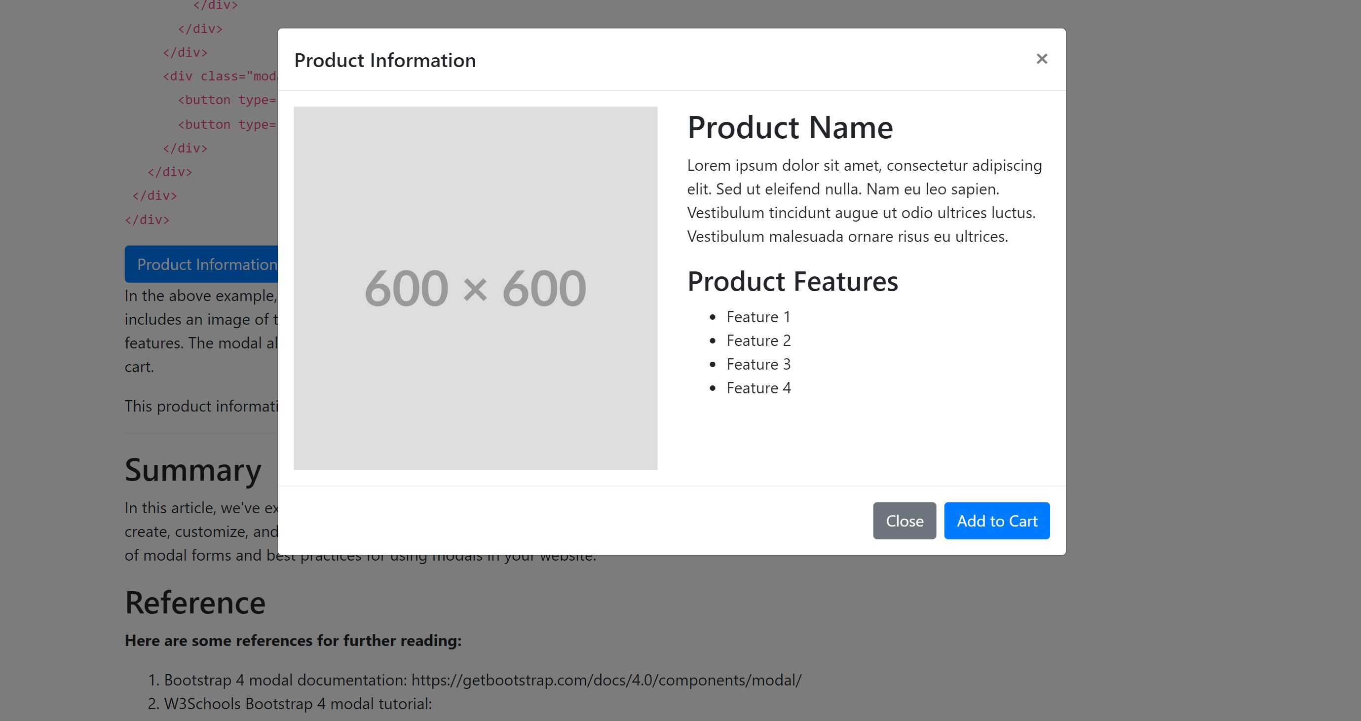
Product information modal:
A modal that displays detailed information about a product when clicked.
A product information modal is a great way to display detailed information about a product when a user clicks on a product image or product name. Here's an example of how a product information modal can be created using Bootstrap 4 modal:
<!-- Button trigger modal --><button type="button" class="btn btn-primary" data-toggle="modal" data-target="#productModal"> Product Information</button>
<!-- Product information modal --><div class="modal fade" id="productModal" tabindex="-1" role="dialog" aria-labelledby="productModalLabel" aria-hidden="true"> <div class="modal-dialog modal-lg" role="document"> <div class="modal-content"> <div class="modal-header"> <h5 class="modal-title" id="productModalLabel">Product Information</h5> <button type="button" class="close" data-dismiss="modal" aria-label="Close"> <span aria-hidden="true">×</span> </button> </div> <div class="modal-body"> <div class="row"> <div class="col-md-6"> <img src="product-image.jpg" class="img-fluid"> </div> <div class="col-md-6"> <h2>Product Name</h2> <p>Lorem ipsum dolor sit amet, consectetur adipiscing elit. Sed ut eleifend nulla. Nam eu leo sapien. Vestibulum tincidunt augue ut odio ultrices luctus. Vestibulum malesuada ornare risus eu ultrices.</p> <h3>Product Features</h3> <ul> <li>Feature 1</li> <li>Feature 2</li> <li>Feature 3</li> <li>Feature 4</li> </ul> </div> </div> </div> <div class="modal-footer"> <button type="button" class="btn btn-secondary" data-dismiss="modal">Close</button> <button type="button" class="btn btn-primary">Add to Cart</button> </div> </div> </div></div>
In the above example, we've created a button that triggers the product information modal. The modal includes an image of the product, the product name, a description of the product, and a list of product features. The modal also includes a footer with buttons to close the modal or add the product to the cart.
This product information modal can be customized further to fit the design and layout of your website.
Summary
In this article, we've explored everything you need to know about Bootstrap 4 modal, including how to create, customize, and use it to enhance your website's user experience. We've also provided examples of modal forms and best practices for using modals in your website.
Reference
Here are some references for further reading:
- Bootstrap 4 modal documentation: https://getbootstrap.com/docs/4.0/components/modal/
- W3Schools Bootstrap 4 modal tutorial: https://www.w3schools.com/bootstrap4/bootstrap_modal.asp
- Bootstrap 4 modal examples: https://mdbootstrap.com/docs/jquery/modals/examples/
Tips
Here are some tips for working with Bootstrap 4 modal:
- Use the data-toggle and data-target attributes to trigger the modal.
- Use the data-dismiss attribute to close the modal.
- Use the tabindex attribute to set the focus on a specific element inside the modal.
- Use the backdrop option to control the visibility of the modal backdrop.
FAQs
Q: How do I change the position of the Bootstrap 4 modal?
A: You can change the position of the modal by adding the modal-dialog-centered class to the <div> element with the modal-dialog class. This will center the modal vertically and horizontally on the page. You can also use custom CSS to position the modal wherever you want on the page.
Q: How do I add images or videos to the Bootstrap 4 modal?
A: You can add images or videos to the modal by adding HTML elements inside the <div> element with the modal-body class. For images, use the <img> element and for videos, use the <iframe> element with the src attribute set to the video URL.
Q: Can I use Bootstrap 4 modal with other CSS frameworks?
A: Yes, Bootstrap 4 modal can be used with other CSS frameworks or custom CSS. However, you need to ensure that there are no conflicts between the CSS styles and classes.
Q: How do I make a Bootstrap 4 modal draggable?
A: By default, Bootstrap 4 modal is not draggable. However, you can add the jquery-ui library and use the draggable() method to make the modal draggable. Here's an example:
<!-- Add the jquery-ui library --><script src="https://code.jquery.com/ui/1.12.1/jquery-ui.min.js" integrity="sha384-DziyJWY6CipvP9o/qoWS0rZKwK5JGM/NbHD1/VvXdTnEiq/6X+kT0h8ZI8T2Q7nF" crossorigin="anonymous"></script>
<!-- Add the draggable class to the modal dialog --><div class="modal-dialog draggable" role="document">...</div>
<!-- Initialize the draggable functionality using jQuery --><script>$(document).ready(function(){ $('.draggable').draggable({ handle: ".modal-header" // Specify the handle for dragging });});</script>
In the above example, we've added the draggable class to the modal dialog and initialized the draggable functionality using the draggable() method. We've also specified the handle for dragging to be the modal header.
Q: Can I use Bootstrap 4 modal without JavaScript?
A: No, Bootstrap 4 modal requires JavaScript to work. If JavaScript is disabled in the user's browser, the modal won't work as expected. However, you can provide a fallback option for users who have JavaScript disabled, such as a separate page or a simple HTML form.
Q: How do I prevent the Bootstrap 4 modal from closing when the user clicks outside the modal?
A: By default, Bootstrap 4 modal closes when the user clicks outside the modal. You can prevent this behavior by adding the data-backdrop attribute with the value of static to the button or link that triggers the modal. Here's an example:
<button type="button" class="btn btn-primary" data-toggle="modal" data-target="#exampleModal" data-backdrop="static" data-keyboard="false"> Launch demo modal</button>
In the above example, we've added the data-backdrop attribute with the value of static to the button that triggers the modal. We've also added the data-keyboard attribute with the value of false to prevent the user from closing the modal using the keyboard.
Q: How do I add custom CSS styles to the Bootstrap 4 modal?
A: You can add custom CSS styles to the Bootstrap 4 modal by creating a separate CSS file and linking it to your HTML document. Here's an example:
<!-- Add the custom CSS file --><link rel="stylesheet" href="custom.css">
<!-- Customize the modal using custom CSS --><style>.custom-modal { background-color: #f8f8f8; border: 2px solid #ccc; border-radius: 5px;}.custom-modal .modal-header { background-color: #333; color: #fff;}.custom-modal .modal-footer { background-color: #333; color: #fff;}</style>
In the above example, we've added a custom CSS file and linked it to the HTML document. We've also added custom CSS styles to the modal using the .custom-modal class. The styles include changing the background color, border, and border radius of the modal, as well as the background color and text color of the modal header and footer.